Theme
POS settings: Settings → Theme in the POS, on this device.
Theme changes how the POS looks: its colours, the size of its buttons and text, its icons and its fonts. It changes nothing about a sale, a price or a receipt. Your choice is saved on this device, for the store you're working in, so the till by the window can be dark while the one in the back stays light.
Open it from Settings, the cog at the foot of the menu, then Theme. A change shows at once and is saved straight away; there is no Save button.
Choose a theme
Tap a tile and the whole POS changes, this screen included. Try one at the till; you can always come back to Light.
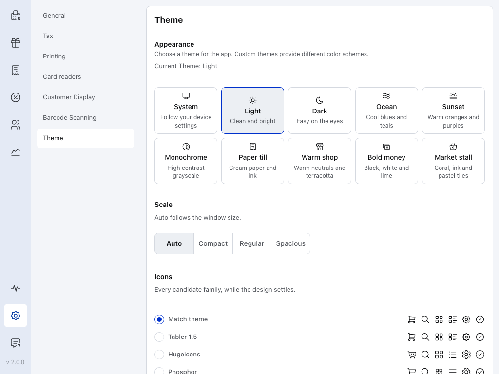
- Theme — this page, under Settings.
- System — follows your device. When the device switches to dark mode, the POS switches to Dark, and back to Light when it switches back. The line above the tiles then reads Following System Theme.
- Light — the outlined tile is the theme in use, and Current Theme above the tiles names it. A new device starts on Light, which suits a well-lit shop.
- Dark — light text on a dark background, for a dim shop or an evening shift.
- Ocean — one of three colour schemes, with Sunset and Monochrome. Ocean and Sunset give the till more personality. Monochrome is high-contrast greys, for a screen in bright light or a cashier who needs strong contrast.
- Paper till — one of four shop styles, with Warm shop, Bold money and Market stall. Each brings its own colours, fonts and icons. See What each theme changes.
- Auto — the Scale a new device starts on. See Make everything bigger or smaller.
- Compact — smaller, so more fits on the screen.
- Spacious — larger. Regular sits between the two.
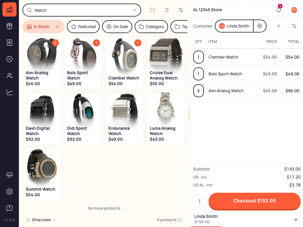
Market stall applied to the selling screen, with an order in progress: the product panel on the left, the cart on the right.
What each theme changes
The four shop styles change more than colour. While Icons and Fonts are on Match theme, each theme brings its own icon style and fonts.
Compare themes, icons and fonts
| Theme | Icons and fonts |
|---|---|
| System Light or Dark, following the device | Icons: Tabler 1.5 Fonts: System |
| Light Clean and bright | Icons: Tabler 1.5 Fonts: System |
| Dark Easy on the eyes | Icons: Tabler 1.5 Fonts: System |
| Ocean Cool blues and teals | Icons: Phosphor Fonts: System |
| Sunset Warm oranges and purples | Icons: Phosphor Fonts: System |
| Monochrome High contrast grayscale | Icons: Tabler 1.5 Fonts: System |
| Paper till Cream paper and ink | Icons: Phosphor Fonts: DM Sans · Instrument Serif |
| Warm shop Warm neutrals and terracotta | Icons: Hugeicons Fonts: DM Sans · Fraunces |
| Bold money Black, white and lime | Icons: Phosphor Fonts: Space Grotesk |
| Market stall Coral, ink and pastel tiles | Icons: Hugeicons Fonts: Manrope |
Make everything bigger or smaller
Scale sets the size of buttons, text and spacing everywhere in the POS. Leave it on Auto unless the screen feels cramped or too sparse.
In Settings → Theme, under Scale, tap Auto, Compact, Regular or Spacious.
- Auto — picks the size from the window: Compact on a narrow window such as a phone, Spacious on a wide desk monitor, Regular in between.
- Compact fits more on the screen; Spacious makes buttons and text larger; Regular sits between them. These three keep the same size when the window changes.
Where Auto switches, and touch screens
Auto uses Compact below 640 pixels wide, Spacious from 1600 pixels wide, and Regular between. Resize the browser or desktop window and the size follows. In the iOS and Android apps, Auto reads the screen's shorter side instead, so turning the device doesn't change the size.
On a touch screen, Compact keeps every button at least 44 pixels high so it stays easy to press; text and spacing still shrink. With a mouse, buttons get the full Compact size.
Pick the icons and fonts
In Settings → Theme, scroll down past Scale to Icons and Fonts, and tap a choice in either list.
Both start on Match theme, which follows the theme (see What each theme changes). Choose an option other than Match theme to keep those icons or fonts when you change themes.
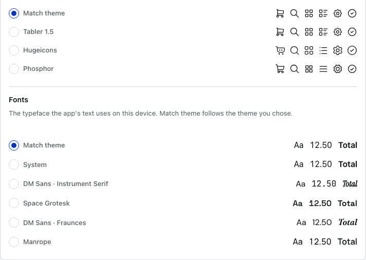
- Icons: Match theme — the top list is Icons. Match theme uses the icons your theme brings. A new device starts here.
- Samples — six icons you meet on every screen, drawn in that family, so you can compare before you pick.
- Phosphor — one of three icon styles, with Tabler 1.5 and Hugeicons. Pick one to use it with every theme.
- Fonts: Match theme — the list under Fonts. Match theme uses the fonts your theme brings. A new device starts here.
- Samples — Aa for text, 12.50 for prices and Total for headings, each in that font.
- DM Sans · Fraunces — one of five font sets, with System, DM Sans · Instrument Serif, Space Grotesk and Manrope. System is your device's own font.
If something goes wrong
- The POS turned dark on its own — System is on and the device went into dark mode. Pick Light or Dark to keep one look all day.
- Another till looks different — each device keeps its own theme. Set it on that device too.
- The fonts or icons didn't change with the theme — Icons or Fonts is set to an option other than Match theme. Set it back to Match theme.
- Buttons are too small to press, or too few fit on the screen — change Scale.
- The theme changed after you switched stores — each store keeps its own theme on this device. Set it again for that store.