Product Display
Display settings decide how the Product Panel looks and where it starts. Press Settings beside the search field to open Product settings. Each change saves as you make it, on this device only, so each till can be set up its own way. To see the panel in use, start at Find a product.
What you can do here:
- Switch between tiles and rows
- Choose what the panel opens on
- Show or hide out-of-stock products
- Change the order products are listed in
- Choose how a product with options opens
- Choose what each product shows
- Set up the filter bar and your own filter buttons
- Go back to how a new device starts
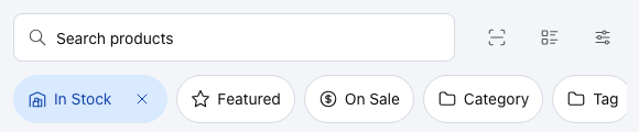
- Grid or table — switches the panel between tiles and rows without opening the settings. See Grid or table.
- Settings — opens Product settings.
Change how the panel looks
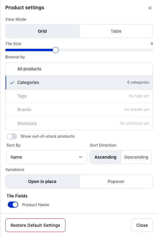
- View Mode — Grid shows tiles with pictures, Table shows rows. See Grid or table.
- Tile Size — how many tiles sit across the panel, from 2 to 8. Only in Grid.
- Browse by — what the panel opens on. See Browse by.
- Show out-of-stock products — off, out-of-stock products are hidden. See Out-of-stock products.
- Sort By — the order products are listed in. See Sort.
- Sort Direction — Ascending or Descending.
- Variations — how a product with options opens. See Variations.
- Restore Default Settings — puts every setting here back to where a new device starts, at once and without asking. It also deletes your quick filters on this device. See Start again.
- Close — closes the settings. Your changes are already saved.
Scroll down for Tile Fields or Columns, Meta Data Keys and the Filter bar.
Grid or table
Grid shows each product as a tile: its picture, name and price. Tap a tile to add one to the cart. A product with options shows … options and opens its variations instead. Table shows the same products as rows, with a + at the end of each row to add it.
A new device starts on Grid, four tiles across. The grid or table button beside the search field switches between the two without opening the settings.
Once a product is in the cart, its tile shows how many in a small circle in the corner. On a row the number takes the place of the +, and tapping it adds one more.
Browse by
What the panel opens on:
| Choice | The panel opens on |
|---|---|
| All products | every product, in the sort order |
| Categories | one tile per top-level category. Where a new device starts |
| Tags | one tile per tag |
| Brands | one tile per brand |
| Shortcuts | one tile per quick filter |
Each choice shows how many it has, such as 6 categories. One with nothing in it is dimmed and says so, such as No brands yet.
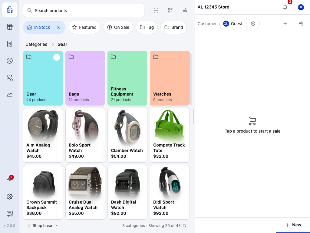
- Categories — the breadcrumb. Tap any step in it to go back up.
- Back arrow — on the tile of the category you're in. Tap the tile to go back one level.
- A sub-category — how many products it holds. Tap it to go in.
- A product — tap it to add it to the cart, as anywhere in the panel.
- 3 categories · Showing 20 of 43 — what this level holds: its sub-categories, and how many of its products are on screen.
Tap a tile to go in. A category shows its sub-categories, its products, or both, as it's set up in WooCommerce. At the top level, an All products tile comes first. A search, or a filter on the same thing you browse by, shows the matching products in place of the tiles.
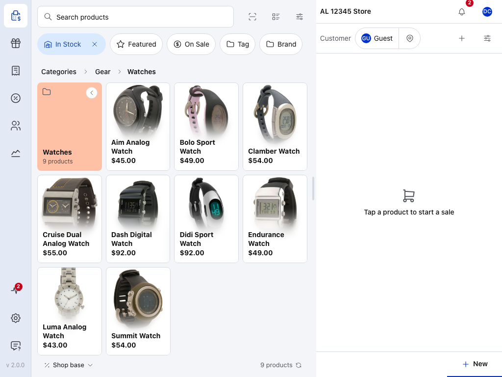
- A product — Watches has no sub-categories, so it shows only its products.
- Watches — the level you're on. Tap Gear or Categories to go back up.
To go back a level, tap the breadcrumb, press Escape on a keyboard, swipe in from the left edge of a touch screen, or use the back button on Android. On a phone the breadcrumb shows only the level above, with a back arrow.
In Table, the same levels show as rows, each with its count and an arrow.
Out-of-stock products
Show out-of-stock products is off on a new device. Off, out-of-stock products are hidden and a scan of one is refused. On, they stay in the list, greyed out and marked Sold out, and the In Stock filter starts switched off.
If your store has Prevent Overselling on, the POS also checks stock as you add:
- … out of stock or Only … available for … — the product isn't added.
- Stock for … hasn't loaded on this device yet — the product's stock is still downloading. Try again in a moment.
- … will be backordered — the product is added. It's set to allow backorders and notify the customer.
Sort
Sort By picks the order: Name, SKU, Barcode, Type, Price, Date Created, Date Modified, Popularity, Stock Quantity, Stock Status or Menu Order. Popularity is total sales, best sellers first when Descending. Menu Order is the order set on each product in WooCommerce. A new device sorts by Name, Ascending.
In Table you can also tap a column heading to sort by it. That changes Sort By here too.
Variations
How a product with options opens. Open in place, where a new device starts, shows its options in the panel, one tile each. The other choice is Popover in Grid and Expanded rows in Table. See Variable Products.
Choose what each product shows
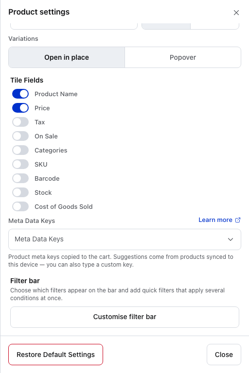
- Tile Fields — what each tile shows. See Tile Fields.
- Meta Data Keys — custom product fields copied into the cart. See Meta Data Keys.
- Customise filter bar — choose the filters on the bar and make your own. See Filter bar.
Tile Fields
In Grid, switch on what a tile shows: Product Name, Price, Tax, On Sale, Categories, SKU, Barcode, Stock and Cost of Goods Sold. A new device shows the name and the price. With On Sale on, a sale price shows the regular price struck through. With Stock on, a tile shows how many are left.
Columns
In Table, the same place lists Columns instead.
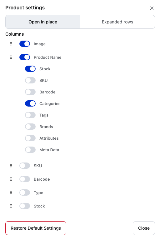
- Expanded rows — in Table, the second Variations choice opens a product's options as rows under it.
- Drag handle — drag a column up or down to move it across the table.
- Column switch — switch a column on or off.
- Display options — details shown under the product name, such as Stock and Categories.
A new device shows Image, Product Name, Price and Actions, with Stock and Categories under the name and On Sale under the price. Under Product Name you can also show SKU, Barcode, Tags, Brands, Attributes and Meta Data. Under Price you can also show Tax.
All columns and what they show
| Column | What it shows |
|---|---|
| Image | The product's picture |
| Product Name | The name, with any details switched on below it |
| SKU | The SKU, in its own column |
| Barcode | The barcode, in its own column |
| Type | Simple, variable and so on |
| Stock | How many are in stock |
| Cost of Goods Sold | What the product costs you |
| Price | The selling price |
| Actions | The + that adds the product to the cart |
Meta Data Keys
Which custom product fields are copied onto the cart line, and so onto the order. See Meta Data Keys.
Set up the filter bar
Press Customise filter bar to choose what sits on the bar above the products.
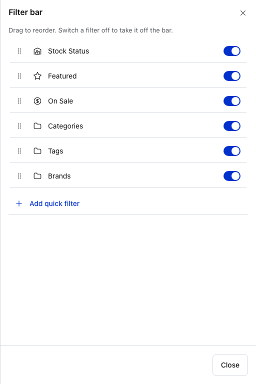
- Drag handle — drag a filter up or down to move it along the bar.
- Switch — switch a filter off to take it off the bar. Switch it on to bring it back.
- Add quick filter — make a button of your own. See Your own filter buttons.
- Close — your changes are already saved.
A new device has Stock Status, Featured, On Sale, Categories, Tags and Brands on the bar, in that order. To take one off without opening the settings, press and hold it on the bar (right-click with a mouse) and choose Hide from bar.
Your own filter buttons
A quick filter is one button that applies several conditions at once, such as On sale in the Shoes category, sorted by price. Make one from what's on screen or from scratch. Your quick filters can also be the first thing the panel shows: set Browse by to Shortcuts.
Save what's on screen
Set the filters you want on the bar, then press the bookmark at the end of the bar, Save as button. It shows once a filter is on.
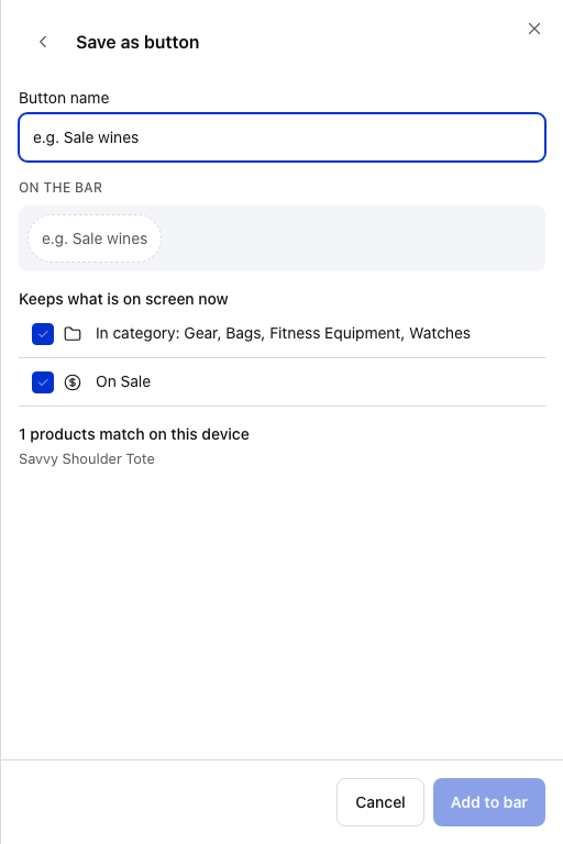
- Button name — what the button says on the bar.
- Keeps what is on screen now — tick the conditions to keep. Inside a category, that category and its sub-categories are one of them. A search is left unticked unless you tick it.
- Add to bar — puts the button on the bar.
Under the ticks it says how many products match on this device. Cancel closes it without adding anything.
Start from scratch
For example, a button for the shoes on sale:
- In Customise filter bar, press Add quick filter.
- Pick On sale in a category. Other starting points are A category, Under a price, Best sellers, New arrivals, Low stock and A tag. To pick nothing, press Start from scratch.
- Under Button name, type a name, such as Sale shoes.
- Under Show products that are…, On sale is already set. In category says Choose…: tap it and pick Shoes.
- Under Then, press Order by and pick Price, low to high. Left alone, it keeps The grid's usual order.
- Press Add to bar. It stays greyed out until the button has a name and every condition is chosen.
After steps 3 and 4, before a category is picked:
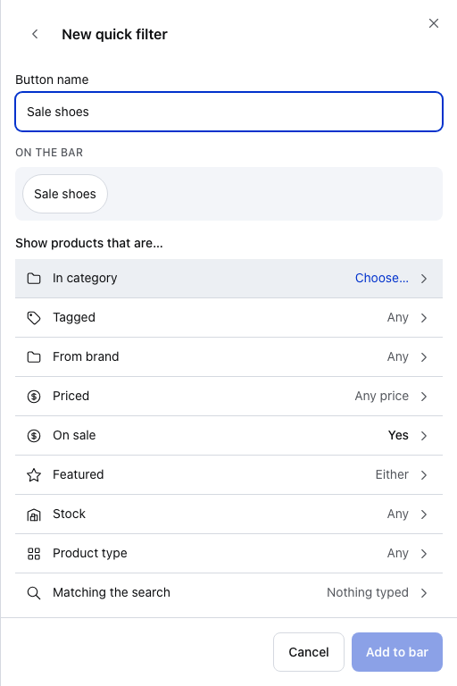
- Button name — what the button says. On the bar shows how it will look.
- In category — says Choose… until you pick one. On sale below it already says Yes. Then and Order by are further down.
Change a quick filter
To change a quick filter, press and hold it on the bar and choose Edit, or tap it in Customise filter bar. Changes save as you make them.
Delete a quick filter
Press and hold it on the bar and choose Remove from bar, or open it in Customise filter bar and press Remove from bar at the foot. Confirm with Delete. A quick filter can't be switched off and kept: removing it deletes it.
Start again
Restore Default Settings, at the foot of Product settings, puts every setting here back to where a new device starts: Grid, four tiles across, Categories, sorted by Name, and the six standard filters on the bar. It asks nothing first.
Restore Default Settings also deletes your quick filters on this device, because they belong to the filter bar.
The panel's footer
- Showing … of … — how many products are on screen, out of those on this device that match.
- Tax basis, such as Shop base — shows when your store calculates tax. Tap it to see the tax rates in use.
- Sync button — refreshes products from your store. Press and hold it for two choices: Sync, the same refresh, and Clear and Refresh, which clears this device's product data and downloads it again.